
定制轮播组件
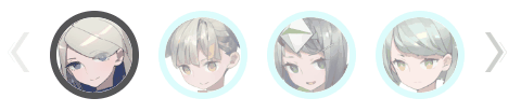
轮播是一个很古老的话题了,市面上也有很多开源组件,我们需要做一些定制化的,所以只有自己动手做一个组件,效果如下 。可以定制视口显示多少个图片,以及图片的样式和效果。
关于图片轮播和无限轮播的原理这篇文章有介绍。
轮播有三个动作,点击向左按钮、点击向右按钮、点击图片。 代码里面有一个imgIdx(图片位置)、displayIdx(显示位置)这两个变量。 点击在窗口内部的图片,不需要改变displayIdx,页面滚动到需要改变displayIdx,这其实就是一个滑动窗口。
imgIdx的范围是0到avatar.length -1。 displayIdx的范围是0到avatar.length - displayNum。
点击👈按钮
只有imgIdx大于0的情况下,imgIdx就减一。 displayIdx代表窗口的移动,情况要复杂一点,首先displayIdx要在取值范围呢,其次imgIdx === displayIdx保证当前取值正好位于位置的左侧。
prev() {
  let { imgIdx, displayIdx } = this;
  if (displayIdx > 0 && imgIdx === displayIdx) this.displayIdx --;
  if (imgIdx > 0) {
    this.imgIdx --;
    this.$emit('prev', this.imgIdx);
  }
}
点击👉按钮
只有imgIdx小于l - 1的情况下,imgIdx就加1。 imgIdx === displayNum + displayIdx - 1保证当前位置正好位于窗口的右侧,再往右移动,就需要移动窗口。
next() {
  let { imgIdx, displayIdx, displayNum, avatar } = this;
  const l = avatar.length;
  if (displayIdx < l - displayNum && imgIdx === displayNum + displayIdx - 1) this.displayIdx ++;
  if (imgIdx < l - 1) {
    this.imgIdx ++;
    this.$emit('next', this.imgIdx);
  }
}
源码如下
<template>
    <div class="carousel">
        <button class="arrow" @click="prev" :disabled="imgIdx <= 0">
            <img src="@/assets/left.png" alt="left">
        </button>
        <div class="carousel-window" :style="`width: ${displayNum * imgWidth}px`">
            <div class="carousel-container" :style="containerStyle">
                <div v-for="(item, i) in avatar" :class="['carousel-item', {'active': imgIdx === i}]" :key="i" :style="`transform: translateX(${i * imgWidth}px) scale(1);`" @click="move(i)">
                    <img :src="item.src" alt="">
                </div>
            </div>
        </div>
        <button class="arrow" @click="next" :disabled="imgIdx >= avatar.length - 1">
            <img src="@/assets/right.png" alt="right">
        </button>
    </div>
</template>
export default {
    name: 'Carousel',
    props: {
      avatar: {
        type: Array,
        default: () => []
      }
    },
    data () {
      return {
        imgWidth: 100, // 图片大小
        imgIdx: 0, // 图片位置
        displayIdx: 0, // 显示位置
        displayNum: 4, // 显示几张图片
      }
    },
    computed: {
        //这里用了计算属性,用transform来移动整个图片列表
      containerStyle() {
        return {
          transform:`translate3d(-${this.displayIdx * this.imgWidth}px, 0, 0)`
        }
      }
    },
    methods: {
      prev() {
        let { imgIdx, displayIdx } = this;
        if (displayIdx > 0 && imgIdx === displayIdx) this.displayIdx --;
        if (imgIdx > 0) {
          this.imgIdx --;
          this.$emit('prev', this.imgIdx);
        }
      },
      next() {
        let { imgIdx, displayIdx, displayNum, avatar } = this;
        const l = avatar.length;
        if (displayIdx < l - displayNum && imgIdx === displayNum + displayIdx - 1) this.displayIdx ++;
        if (imgIdx < l - 1) {
          this.imgIdx ++;
          this.$emit('next', this.imgIdx);
        }
      },
      move(i) {
        this.imgIdx = i;
        this.$emit('move', i)
      }
    }
  }
<style lang="less" scoped>
    .arrow {
        border: none;
        outline: none;
        padding: 0;
        margin: 0 10px;
        cursor: pointer;
        background-color: transparent;
    }
    .arrow img {
        width: 20px;
    }
    .arrow:disabled {
        opacity: 0.4;
        cursor: not-allowed;
    }
    .carousel {
        overflow-x: hidden;
        position: relative;
        display: flex;
        align-items: center;
    }
    .carousel-window {
        overflow: hidden;
    }
    .carousel-container {
        text-align: center;
        height: 120px;
        transition: all 100ms ease-in;
        width: auto;
        position: relative;
        .carousel-item {
            position: absolute;
            bottom: 0;
            left: 0;
            width: 100px;
            height: 100px;
            display: inline-block;
            overflow: hidden;
            z-index: 0;
            cursor: pointer;
            img {
                width: 70px;
                height: 70px;
                border-radius: 50%;
                border: 6px solid #BBFAF9;
                opacity: 0.5;
            }
            &:hover:not(.active) {
                img {
                    border-color: #BBFAF9;
                    opacity: 1;
                }
            }
        }
        .active {
            img {
                border-color: #555;
                opacity: 1;
            }
        }
    }
</style>